
What differentiates a good infographic from a great infographic? Visuals? Data? Readability?
The key to building a memorable and effective infographic is balancing these components.
Infographics are used in a myriad of ways, educating and persuading audiences. Their purpose is to present data or complex information in a way that is easy for readers to understand.
To tie in my blog’s themes, I’ve found a few infographics promoting sustainable practices and providing helpful tips and tricks for people learning how to cook. I will provide an analysis to showcase what they did well and suggest areas where they could improve. My analysis will cover several important components. These include visual hierarchy and organization, color choices, typography and readability, balance of text and visuals, and how well they tell a story with data.
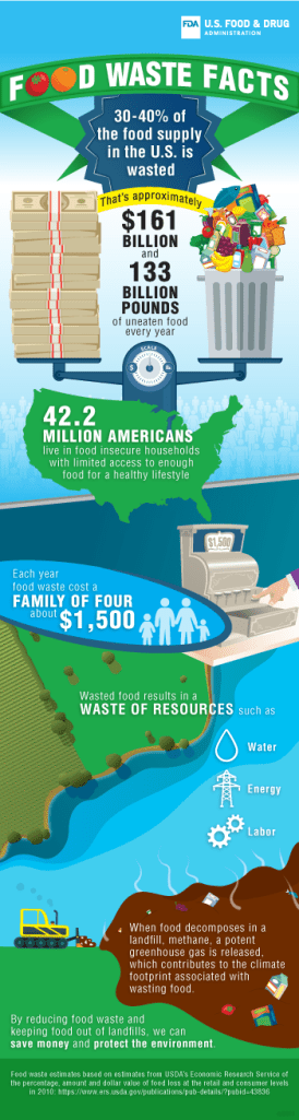

Let’s start by discussing visual hierarchy and organization. The visuals in the first infographic, “Food Waste Facts,” are eye-catching and directly related to the information and data presented. The scale balancing the cash and the garbage can shows the correlation between wasted money and wasted food each year. Directly below, there is another visual stating how many Americans live in food-insecure households with limited access to healthy foods. This organization between the visuals is effective because it draws attention to the data and connects the dots for the reader to help them understand why food waste is such a big problem. Although the visuals are attention-grabbing, they should be spaced more evenly and less condensed at the top.
In the second infographic, “Shop Smart & Save,” the visuals are strategic and used as bullet points. This emphasizes each tip and creates an organized layout. The layout feels balanced; there is one large visual and several smaller supporting visuals. If I were making an infographic, I would include one main visual and a few smaller ones connected to my data and information.
Color makes everything more interesting. A black-and-white infographic would not be effective. Color reflects certain themes and moods, and separates one part of text from another. In the first infographic, white is used for all text, creating consistency across texts. Additionally, white stands out more on this infographic because it doesn’t blend in with the rest of the darker colors. The overall color palette includes earthy tones such as blue and green, which are symbolic of the planet. In the second infographic, the use of red serves several purposes. First, it separates the main text from the supporting text. Second, the color red connects with the American Heart Association (AHA), since the color is symbolic of hearts.
Typography is another key element of an infographic. These infographics use typography to separate one idea from the next. Both examples have portions of their text in bold, which enhances clarity and readability. One suggestion for the first infographic is to increase the font size of their call-to-action (CTA.) Their CTA is located at the bottom of the infographic and is a much smaller text size than their data and information at the top. The CTA should get just as much room as the supporting data points. The second infographic does a good job of increasing the font sizes and bolding points throughout, promoting overall readability.
As I mentioned, finding the balance between text and visuals separates a good infographic from a great one. This balance is important because it ensures your reader is not overwhelmed or underwhelmed with information. The first infographic does a good job connecting each data point with a visual and doesn’t add any unnecessary elements. Additionally, the background of land and water creates a nice foundation for the text and allows it to stand out. The second infographic has a lot of text, but it doesn’t feel overwhelming because they balanced it with a large image that takes up a quarter of the page.
Lastly, data. Data is important for several reasons. The first reason is that it adds credibility to your argument. If you don’t have data to support your statement, people are less likely to take away information or feel motivated to do something. The first infographic included data that supported the call to action. This is the part where the second infographic missed the mark. They should have included data that supports their argument to shop smart and save. My suggestion would be to include data that discusses issues with food waste, or how much the average person saves by using coupons, etc. This would have a bigger influence on the reader and their motivation to create a budget when shopping.
Although each infographic has some areas to improve, their overall design is effective and communicates clearly to their target audiences. Through visuals, organization, color, typography, and data, these infographics contribute professional content that inspires action from readers.
To learn more about infographics and how to use them, check out these articles:
https://www.searchenginejournal.com/infographic-benefits/267781/
https://designlab.wisc.edu/resources/projects/infographics-and-data-viz/

Leave a comment